Adobe Lightroom is one of the most powerful tools out there for photographers. It’s the photographer’s equivalent to Microsoft’s Excel, which nerds and bean counters have loved for generations because of its flexibility to do literally anything you throw at it. Lightroom is almost that powerful. It’s almost a one-stop-shop for a photographer’s entire editing workflow.

That said, just like Microsoft Excel, it can have a very steep learning curve for photographers just starting out. The program has been around since 2007, a time when digital cameras were finally starting to take over the professional market. Digital cameras meant that photoshoots could encompass hundreds or even thousands of photos, and there was no additional cost, or time spend developing individual rolls of film.
But while large volumes of photos are really cool, if there was no way to process them efficiently, what’s the point? Photoshop is the most powerful tool out there, but it’s not able to organize, catalogue, refine, label, and edit all in one program. Initially, Adobe had Bridge to help with cataloguing and labelling, but it just wasn’t enough.
How to use this article
Now that you have the history, I’ve been working with Lightroom pretty well since the day it came out. I’ve been through nearly every iteration of the program since Adobe switched over to Creative Cloud. This program has been essential to my everyday life as a professional photographer.
This article is a living, breathing document that will be constantly updated with all of the latest blog posts over the course of Photography Academy. It will contain everything, from the important process to advanced techniques like photo merging, cloning, preset making, local adjustments, among others. If you have specific questions, use Ctrl or Cmd + F in your browser to search for some keywords. Just below this are the photography specific terms that are used in this article. So if you’re confused about the terminology, or don’t know how to ask your question, this section will be the best place to start.
In the meantime, here are some quick links to the most important sections.
| Terminology | Importing Photos | Library Module | Develop Module | Presets | B&W Conversion | Curves | Hue Saturation Luminance color toning | Dodge and Burn | Computer recommendations | Straightening photos | Shooting in Jpeg or Raw | Editing on an external hard drive | Getting started with Editing | Sharpening |
If there’s anything you want to see here, reach out to me in the comments below, or on Instagram.
 Getting started with Lightroom
To start, I’m going to go over the terms that’ll be used in this article. One of the reasons that Lightroom can be so overwhelming, is that the terminology can be so foreign to people who are new to photography. If you don’t know what you’re talking about, it’s hard to even know what questions to ask the experts.
Most of the terms used in Lightroom come from the film days, but of course, many new terms have been added since then. I’ll start with the most commonly used words, and continue from there. If you come across a word in this guide that you don’t know, most likely you’ll be able to find it here by pressing Ctrl+F (Cmd+F on Mac) and typing the word to search on the webpage.
Lightroom Classic Terminology
Slider – The adjustment controls. These are mostly found in the editing panel, but they control how much of a certain effect is used. For example, Exposure in the basic editing panel in the Develop Module. The Exposure Slider is the control used to affect the overall brightness of an image.
Module – In Lightroom Classic, these are the view modes on the top right of the application. By default, when you open Lightroom, you will be in the Library Module. Editing takes place in the Develop Module just next to it.
Raw Photo – The large, uncompressed image format produced by your camera. Every manufacturer has their own Raw File variant, like .cr2/cr3 for Canon, .arw for Sony, or .nef for Nikon. Every raw file works a bit differently, but all of them give the user the most information and dynamic range possible for photo editing.
Dynamic Range – The amount of detail captured by a camera. A camera that has a high dynamic range will be able to capture and show more details in the highlights and shadows of a given scene
Thumbnails – Taken from darkroom editing, thumbnails are the images on a contact sheet, which shows the immediate image without enlarging. These images on the contact sheet were often no larger than a thumbnail when using 35mm film, hence the term. In Lightroom, these are the images in the Library panel and in the filmstrip along the bottom row of every panel.
Filmstrip – this is the set of images on the bottom of every panel in Lightroom.
Image description terminology
Contrast – the visible difference between the whites and blacks in an image. More contrast means the dark parts will be darker, and the bright parts will be brighter. Flat contrast means there will not be a large difference between the bright and dark parts of an image. Another way to describe a flat contrast is to say an image looks grey.
Stops – A logarithmic measure of overall exposure. 1 stop brighter is exactly twice as bright as before.
Warmth/Coolness – A measure of how yellow or blue an image is. This is controlled by the temperature slider in the Basic Editing Panel
RGB, sRGB, CMYK – These are color spaces, or different systems computers use to read colors. RGB dictates colors in terms of Red, Green, and Magenta. sRGB uses the same, but in a smaller, compressed range and is designed for uses on the web. CMYK stands for Cyan, Magenta, Yellow, and Black. CMYK is the standard color space designed for printers, which often utilize these color cartridges.
DPI/PPI – Dots Per Inch/Pixels Per Inch. This is a measure of how much detail there is in every single inch. If there’re 300 pixels, that means 300 individual colors written into a single square inch. Higher numbers will mean better color gradients, but take up more space. Low numbers create very lightweight files but can result in choppy looking images.

Hardware terminology
Processor – the hardware that crunches numbers and executes programs. Having a good processor, like an Intel I7 or AMD Ryzen 7 will help your computer execute functions faster.
Ram – Stands for Random Access Memory. These are chips that are extremely fast to temporary data to, which is then deleted after it’s no longer necessary. Lightroom and Photoshop are known to store a lot of information in Ram, which can slow down processing speed if there isn’t enough. This is a cheap upgrade that can often make a world of difference.
Graphics Card – like a processor, but specifically for rendering graphics, like the images on your screen. A faster graphics card, with its own dedicated ram will make Lightroom much faster. It’s harder to find dedicated graphics cards on laptops because they take a lot of space and produce heat. This is one of the main advantages for desktop computers over laptops.
Resolutions and computer memory
4K, 1080p – monitor resolutions. 4K shows 4 times as much detail as 1080p but requires faster processors to avoid slowing the computer down.
Hard drive – this is the device that stores your data. There are external hard drives which serve as additional, portable storage devices for editing on the go, and internal hard drives which are built into the computer. Hard drives come in two forms:
- HDD – stands for Hard Disk Drive. These are slower, but more reliable hard drives that can store massive amounts of files. The technology has been around forever, so they’re cheap to purchase and manufacture. But they have small moving parts that can break if they take a hard fall!
- SSD – stands for Solid State Drive. These are faster, top of the line hard drives that can make a world of difference in your editing workflow. The read and write speeds are much faster than HDDs, so they make the editing process a breeze. They also have no moving parts, so they’re not as breakable as HDDs, but they’re far more expensive.
Installing Lightroom Classic
Lightroom Classic is pretty straightforward to install when you know the proper steps. Every time I help a friend or put it on a new computer, there always seems to be some kind of hassle. So I put together this step-by-step guide to getting it running on your computer!
If you haven’t purchased it, click here to do a Google search for the Adobe Photography Bundle. This plan is all you’ll need if you just want to use the photography applications. The bundle will give you access to Lightroom, Lightroom Classic, Photoshop, and Adobe Bridge.
Once you’ve purchased a subscription, you’ll be directed to download Adobe Creative Cloud. This is the application that will allow you to install the Adobe applications, manage fonts, ensure your subscription is active, and keep the applications up to date.
What’s the difference between Adobe Lightroom and Lightroom Classic?
Lightroom is Adobe’s new cloud-based application that syncs with your cell phone or tablet. It’s a paired down version of the real Lightroom Classic, which is the powerful Desktop-based application. For this guide, and to use all of the powerful tools that have helped nearly every great photographer, you’ll want to install Lightroom Classic.
In the Creative Cloud Application, the first option will be Lightroom. Make sure to Scroll Down until you see Lightroom Classic with the LrC lettering inside a blue box. Click install, and the application will be ready in a moment’s notice.
Library Module
This section gives an overview of the Library module. This is where you organize and select the images that you’d like to process further in Lightroom. The Library module makes photo comparison very simple, as you can see entire sets of images side by side in the same view.
After import, I use this module to flag and label photos so that I can filter and edit only the images that I believe will be my finals. This is also a great place to review final images after the edits are complete. When you’re comparing the final edits side by side, you can use the quick editing panel to fix minor temperature, tint, contrast, and exposure imbalances.

Importing Photos
When you open Lightroom, you’ll be in the Library Module where you can see all of your photos. To start editing your photos, you’ll have to import them using the Import Button on the bottom left-hand corner. Once you click import, you’ll be directed to find the folder where you’ve placed your photos in the Finder system. If you imported your photos automatically from the camera, this will likely be in Pictures on PC, or Photos on Mac.
Personally, I always move new photo sets onto my Desktop with a descriptive name so that the folders are easy to find and move between hard drives.
Once you find the photos and import them into Lightroom, you’ll be able to begin editing. However, if you rename, or move the folder, you will have to re-locate the images or the folder next time you open Lightroom.
What happens if I move my photos?
If you move your photos after importing them into Lightroom Classic, the program will not be able to make edits until they’re relocated. Luckily, relocating images is an easy process if you made the change intentionally.
Once you re-open Lightroom, you will see exclamation points on top of your images. Click the exclamation point on the first image in your set, and go through the Finder or File Explorer to find where the files were moved to. Once you find the folder, click on the first image in the folder, and click choose. Lightroom will then automatically find the rest of the photos in the set, and once again be editable.
If you receive an error saying the file name is different than the one in the folder you chose, then you will have to search for the photo with the same name. Likely what happened in this case, is that Lightroom ordered the photos by capture time, and the file names in camera rolled over from 9999 to 0001. In this case, you will have to find the filename of the first photo you’d taken, and select that image.
Click Here if you want to learn how to edit on an external hard drive. As this method can help some users stay organized with long term storage and backups.

Labelling, organizing, flagging images
Lightroom has some functional tools that will allow you to quickly select the best photos for editing. There’s nothing worse than going through every image one at a time, so it’s best to organize using the Library module.
Press P to set a picture as a “Pick,” X will set a picture as ‘Rejected,’ and U will ‘Unflag’ an image — in case you accidentally Picked or Rejected the wrong one. You can also filter the images by stars! Use 1, 2, 3, 4, 5, and 0 to set star ratings for each image. It’s also conveniently possible to set color labels using 6, 7, 8, and 9.
And for a bonus tip: turn on Caps Lock if you want Lightroom to automatically move to the next image after setting a label.
I go into this process and give some tips on how I set my own labels in this article.
Filtering images
After you’ve starred, picked, or color labelled your photos, you can filter the images in both the Library and Develop modules. On the right side of the screen, just on top of the filmstrip is the word Filter. By default, no filters are shown. But if you click the word filter, they’ll all magically appear.
You can filter by any combination of functions: picks, rejected images, unflagged, starred, not starred, or by color. I use this all the time to see which images still need work, and which ones are ready to go.
Quick Develop panel
 In the Library module, there is a wonderful space where you can do quick changes to your images called the Quick Develop panel. It’s located on the right side of the screen underneath the histogram.
This panel will allow you to do auto-editing or use any of the functions in the basic panel. However, it doesn’t give you the same fine controls as the basic panel does in the Develop Module. By default, the quick editing panel only allows you to edit Exposure, Clarity, and Vibrance. But if you press the little triangles to the right of White Balance and Tone Control, they will show all of the basic editing parameters, like temperature, tint, highlights, shadows, and more.
There are four buttons for each type of edit that look like this: << | < | > | >>. The outside arrows [<<|>>] will increase or decrease the effect by one stop for exposure, or +/-20 for the other effects. The inside buttons [<|>] will increase the settings by 1/3rd of a stop for exposure, or +/- 5 for the other effects.
This panel is mostly useful when reviewing pictures side by side. If the images are part of a set, like a print album, this can help you see which images are not the same white balance as the others.

Using Lightroom catalogues
The Lightroom Catalogue is a file that stores all of the information related to every photograph you edit in Lightroom. It is possible to make more than one catalogue, although it’s not always advisable. Before you import your first photo, every catalogue is over 600 megabytes in size! So these files will take up a lot of hard drive space. For reference, my current catalogue has over 48,000 photos and is only 1.5Gb, just over the size of 2.5 empty catalogues.
As well, if the catalogues are not properly named, they can be confusing and cumbersome to use and backup. There are times and places for when to use new catalogues, though. If you transfer your files between editors, having a catalogue with smart previews solely for specific sets of images can be extremely powerful. That said, you can also import photos and their edits from another catalogue, and export a set of images as it’s own catalogue for these purposes.
To make a new Lightroom Classic Catalogue:
- Open Lightroom Classic
- Under file, click New Catalogue
- Give a descriptive name to the Catalogue, and press Create
Lightroom will then automatically open the new catalogue so you can begin editing.
Importing and Exporting catalogues
To export a set of images as a catalogue:
- Open Lightroom Classic
- Select all images in the set you’d like to export using Ctrl+A (Cmd+A on mac)
- Under file, click export as catalogue, give the file a descriptive name, and click Save
Additional options that you’ll be given when exporting a catalogue:
- Export Negative Files – means that Lightroom will copy a new set of Raw files into the catalogue folder. This will increase the folder size by the same amount as the raw files.
- Build/Include Smart Previews – This option will build smart previews or include the ones that were built previously. Smart Previews are lightweight image previews that are editable like raw files, but without taking up much extra space. This is an extremely handy alternative to sending raws over the internet.
- Include Available Previews – Lightroom will package the previews your computer-generated on import, and while editing the images. These can help the other editor save a slight bit of time, but will add additional weight to the files you’re sending. I personally don’t recommend this.
Importing from another catalogue will bring those raw files or Smart Previews and their edits into your catalogue. This way you can keep your own organization while working with another person’s files.
- Open your Lightroom Classic Catalogue
- File, Import from Another Catalogue
- Find the unzipped file on your computer, and click Choose
And that’s it! After this, you’ll be an expert at collaborating on sets with other photographers. This is especially useful if you’d like to outsource your own edits or become a freelance image editor. Bonus tip: You can leave quick notes for your editor with the brush tool. Make the brush as small as possible without feathering, bring blacks and exposure all the way down, and write away.
Using the Develop Module
The Develop module is where most of the editing magic happens. This part of the guide is meant to show you the different tools and functions that are available to you. Every editor will have a different workflow, so some of these tools will be more useful to you.
If you want to get into the weeds of editing, click here to go to the editing section.

Navigator, and zooming in on your photo in Lightroom
 The Navigator is the smaller image in the top left corner of the Develop Module. This image will always stay the same size, adjusted for your screen, and helps you see where you’re zooming in on your image. The further you zoom in to edit or check a photo, the more likely you are to get lost. When you’re zoomed in, the white outline on the navigator will show you which part of the photograph you’re currently looking at.
One frustrating thing about Lightroom is that you can only zoom in by three variable numbers that you can set yourself. By default, Lightroom automatically sets these values to fit, 100%, and 300%. But it can be changed to zoom in as much as 1,600% for the pixel peepers out there. If you press the spacebar in the Develop Module, you will zoom in on the middle of your image to the larger percentage value. Press the spacebar again, and you’ll zoom out. Double click on a specific area of the image, and it will zoom in where you click.
You can also look around the image by clicking on different areas on the navigator, or by clicking and holding while moving the mouse. To change the amounts that you zoom in on an image, click the set of arrows on the right side where it shows the percentages above the navigator. Choose the zoom level you’d like to use from the drop-down list. And next time you double click, it’ll go in by that prescribed percentage.
History and Snapshots
The history options in Lightroom let you see exactly what edits you’ve made to an image. This can let you see how an image has changed at every single change. If something went wrong, you can go back and fix it at a moment’s notice, but you’ll have to give up all of the history states that came after that edit.
You’ll find the history panel on the left side of the develop module, just underneath the Navigator (description above).
 Snapshots allow the editor to save and label different states of the editing process. Once you get to a point that you like, you can save a history state so that if you go off and make some crazier changes to the colors and contrast, you can always get back to where you were. Create a snapshot by pressing the plus button next to the Snapshot title, found on the left of the Develop Module underneath Presets, and above History. You’ll have the option to give your snapshot a descriptive name before saving it.
Presets
Presets are one of the most powerful tools available in Lightroom. They can reduce your editing time by hours with just a single click! It’s one of my favourite things to show new photographers because these can help show you want your images can look like. Over time, I always suggest experimenting and developing your own presets, as these will help you build a cohesive body of work.
There are two places to apply presets to your photos:
- On the right side of the Library Module. in the quick editing. Here, you can add a preset using the drop-down menu.
- On the left side of the Develop Module. Here, you can mouse over presets to see a preview on your image. Click the preset to apply the settings changes.
If you recently bought presets, you can import them into Lightroom using these quick steps:
- Go into the Develop Module in Lightroom
- On the left-hand side, click the Plus Button next to Presets
- Scroll down and click Import Presets
- Find your preset pack in a .zip folder, and click Import
Of course, there’s a lot more to learn about using Presets in Lightroom. If you’re ready to learn more, I’ve written an in-depth article about using and creating presets here. Or, if you’re interested, I’ve created a set of my own presets that I’m giving away! Take a look at these free presets that I’ve used for many of my own award-winning fine art landscape photographs.
Using the Histogram
 The histogram is your best friend. In Lightroom, you can see the histogram in a very prominent position in the Develop Module. It’s the waveform diagram in the top right, just above the editing panel that shows you exactly which parts of the image contain the most information.
This piece of technology works just like an audio waveform. If it’s too far to the right, the image is overexposed and might be losing detail in the brightest parts of the image. Too far to the left, and you’ll have all of the highlight information, but you’ll be sacrificing a lot of shadows. The general rule is underexposed images can be brought back, although they’ll be noisier, and have less detail. But if an image is overexposed, there’s no saving it. Overexposed highlights cannot be brought back by turning down the exposure, highlights, or whites sliders in the basic editing panel — they’ll simply come out grey.
So the histogram is an especially useful tool when you’re out in the field. If you keep an eye on the one built into your camera, you’ll be sure to always come back with the best exposure for each situation. Learn more about reading the histogram in this quick, handy article.
Getting started with Photo Editing
Here’s where the magic happens. In this section, I’ll be going over the basics of editing in Lightroom. These are the steps that you’ll be doing on nearly every photo, even if you’re using presets! All of these edits are simple, and fun to experiment with.
Basic editing panel
The basic editing panel is where all photo manipulation starts. This panel, on the right side of the Develop Module, is where you control effects like exposure (how bright an image is overall). The basic editing panel is divided into three sections: White Balance, Toning, and Presence.
White Balance
The white balance section controls the overall temperature and the tint of a photo. The temperature will control how yellow (hot) or blue (cold) an image is, and the tint controls how green or magenta. Both of these controls work in tandem to produce different effects, like a cold, winter day, or a hot, sunny evening.
You can also choose a white point in the photo, which will make Lightroom automatically adjust the white balance to make that object white. To do this, click the White Balance Selector tool, or press W, then click on the part of the image that you’d like to be white. On the top right of the White Balance section, there is a drop-down menu that will let you choose between white balance as shot, auto, or custom. If you move the sliders or choose a white point yourself, Lightroom will automatically change the white balance setting to “Custom.” To reset any white balance settings, double click the word Temperature or Tint.
Learn more about these controls, and how to use them to correct inaccurate color casts, like those from Neutral Density filters in this article.
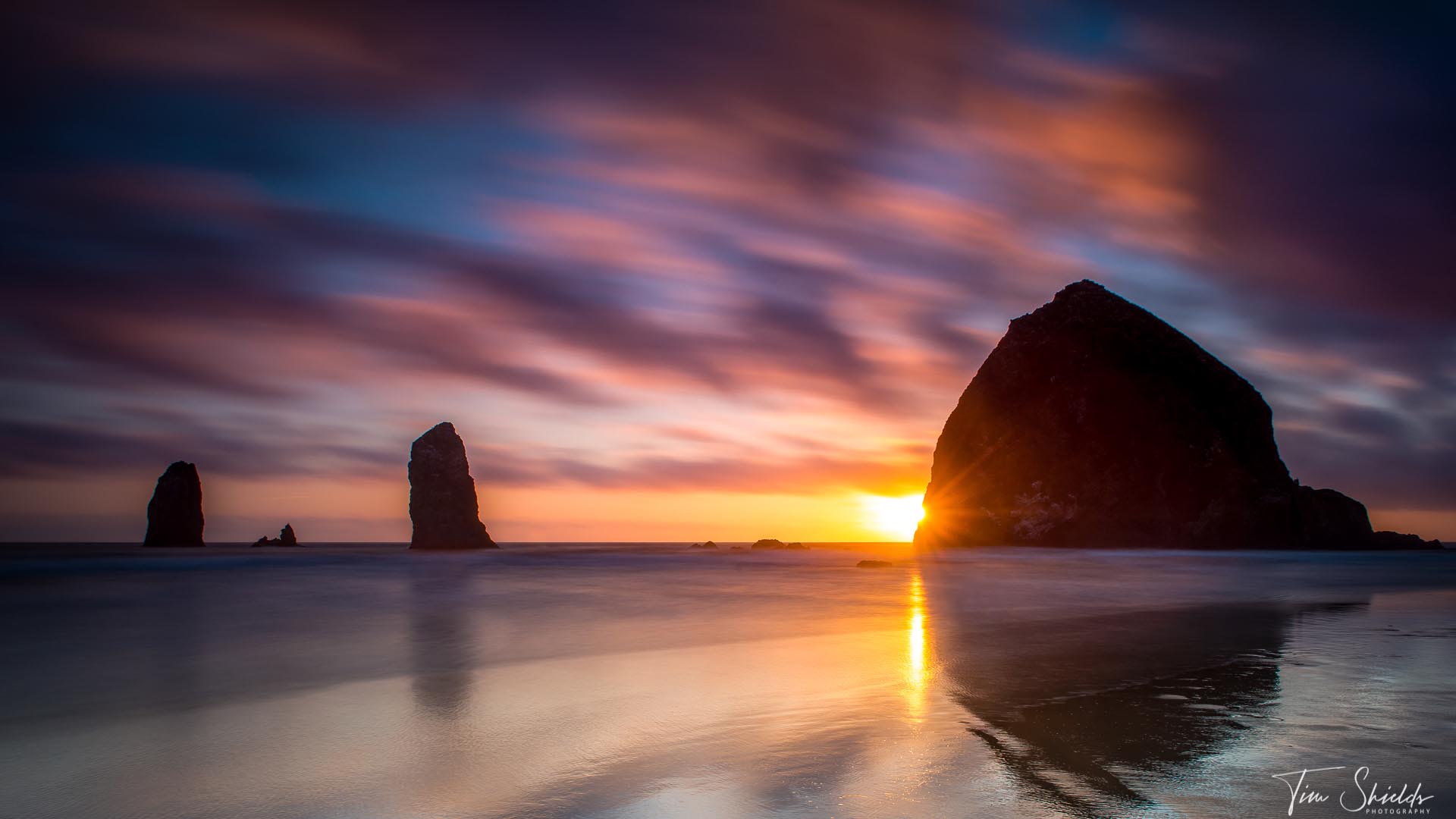
 Click this image to find out why RVing is the best way to travel for landscape photographers!
Toning
The toning section has sliders for exposure, highlights, shadows, whites, and blacks. Pull the sliders to the right, and different parts of the image will become brighter. To the left, and they will become darker. The only exception is the first section is the contrast slider. If the image is overall dark, increasing the contrast by moving the slider to the right will darken the image, and will brighten it by moving it to the left.
You can increase the dynamic range to see every detail in your photos by pulling the shadows slider to the right, and the highlights slider to the left. But be careful, digital photos have a lot of detail in the shadows, but not as much in the highlights. If you’d like to learn other methods on how to increase the shadows without ruining your images, take a look at this guide.
Just like with White Balance, and any slider, if you double click the name of the effect, it will go back to zero.
Presence
This is where you control how saturated, sharp, and punchy an image is. Be careful, though, it’s very easy to overdo it with these sliders and create unrealistic looking images. When used effectively, these will liven up dull images, or decease the punchiness if you’re looking for a film effect.
The texture slider affects only the texture, but not the sharp lines of an image. This is a perfect effect for subtly softening part of the image to make it stand out less, or reducing the texture of the skin. Next is clarity, which will sharpen every existing line in an image, and can bring out grain or ISO noise. While the clarity slider is promising, it cannot save an unsharp image. You can also have more control over the sharpness of an image in the Detail, Sharpening, and Noise Reduction settings.
The Dehaze slider affects multiple settings in both the Presence and Toning sections. Using this slider will increase contrast, saturation, and clarity while reducing the shadows and blacks. The effect of the dehaze slider brings more punch to cloudy, hazy, or slightly blurry sections. This effect can be used to effectively reduce smog or other atmospheric conditions that blur a section of the photograph.
Last on the list is the Saturation and Vibrance sliders. These affect how strong the color is. Vibrance will only affect the duller, muted colors to bring them to the same level as the punchier tones in an image, while Saturation affects all colors equally. For more advanced color management, you will have more control over saturation and vibrance in the Hue, Saturation, and Luminance (HSL) panel.

Turning Photos Black and White
At the very top of the Basic Editing Panel is a control, called treatment, where you can choose if your photo is color, or black and white. By default, all photos use the Color treatment. To make your photo Black and White, simply click the words, Black and White. A black and white preview file will then be generated in front of your eyes.
Once a photo is Black and White, you’ll have access to an additional panel below the Tone Curve called B&W. This panel has a set of RGB sliders that will adjust the Black and White image by the color data from the original color images. For example, if you slide the green slider to the left, all of the parts of the image that were green in the original will become darker. This can be used to create contrast, as well as effects like filters in Black and White Film. For example, you can darken the sky by pulling the blue slider down — just like using a red filter in B&W film.
There is also a picker in the top left corner. If you click that icon, you can click any spot on the photo, and drag to the left to darken their respective colors. This is a very powerful tool for creating unique B&W contrast.
Sync, autosync, and Previous
These are tools that you’ll need for batch editing. The Sync/Autosync, and Previous button is located at the bottom of the editing panel on the right side of the Develop Module, just above the film strip. These buttons are used to synchronize your edits between photos.
The Previous button synchronizes every edit made on the image before it. If you’re batch editing, making quick changes to every photograph, this can be very useful for ensuring each image has the same contrast. However, once you start cropping, straightening, and applying local adjustments, the previous button will apply those to the next image, which could take more time to fix than starting fresh.
In that case, it can be useful to use the Synchronize button, which will allow you to choose which edits are applied to the synchronized photographs. To use the Sync button:
- Click the photo with the edits you’d like to synchronize onto other photos.
- Holding Ctrl (Command on Mac), click each other image that you’d like to synchronize the edits onto
- Click the Sync button at the bottom of the editing panel
- Check the boxes next to the photos that you’d like to apply the synchronizations, and uncheck the settings that you don’t want to be applied
- Press Synchronize
But what if I need more synchronization power?
Okay, but what if there was a button that would allow you to simultaneously edit an unlimited amount of photographs? Would that be too much power for one man? According to Adobe, no, it’s just enough power for one wo/man, and it’s called AutoSync.
To turn on AutoSync, hit the light switch on the left side of the Sync button, and you’ll see the text-transform. Now, select all of the images that you’d like to AutoSync, and start editing to your heart’s content. Be sure to turn AutoSync off when making local adjustments or cropping!
AutoSync isn’t used all that much for normal editing. But it is an especially useful feature when making overall adjustments to presets.

Straightening, Cropping, and Composition Rules
I almost never take photos that don’t need some kind of cropping. Even with zoom lenses, it can be difficult to properly compose an image using such a small viewfinder. Luckily, with large sensors and modern technology, cropping and re-composing in Post Production is an easy, and necessary task for every photographer to learn.
The crop tool is at the top of the editing panel in the Develop Module. On the left side, just below the histogram is a square with the Rule of Thirds drawn inside. Click this square or press R to begin cropping an image. By default, you’ll see the Rule of Thirds overlay on the image. Press O to see different composition Rules overlays, and hold Shift + O to rotate or adjust the overlays.
While the crop tool is open, click and drag the overlay from the sides to crop the image. Press enter or click Done at the bottom right corner when you’re finished cropping.
By default, Lightroom will allow you to crop to any aspect ratio. Hold shift while cropping to maintain the aspect ratio, or click the padlock in the editing panel to lock the aspect ratio in. If you want to crop to a specific aspect ratio, like square, or the cinematic 16:9 aspect ratio, click the drop-down menu where that says “Original Ratio” (beside the padlock) and choose your desired ratio.
To rotate an image, hover your mouse just outside the corners of the crop overlay, and click and drag to rotate the image. You can also automatically level, rotate, or align the images in the Transform panel.
Learn more about cropping, rotating, straightening, and flipping images in this helpful article.


Dodging, Burning, Brushing, and local adjustments in Lightroom
Some of the most powerful tools in Lightroom can be found in the local adjustments section. This is all the tool to the right of the crop tool, just below the histogram in the editing panel in lightroom. The local adjustments include the Adjustment Brush (K), Radial Filter (Shift + M), and the Gradient Tool (M).
All of these tools can be used to add any of the basic editing effects to different parts of the image, instead of making overall adjustments. In many cases, these can make it unnecessary to even open Photoshop!
Both the Radial (Shift+M) and the Gradient (M) filters feather an effect across an area. The gradient tool can be used to burn (darken) a sky or dodge (lighten) a foreground. The Radial Filter tool can be used to make a vignette.
Learn more about how to use adjustment brushes to make fine-art landscapes easily in Lightroom in this handy guide.
Tone Curve
Have you ever wanted control of not just the highlights or shadows, but a very specific region of those tones? Well, the tone curve is exactly what you’re looking for. In some of the latest updates, Lightroom has changed curves to give you control of the overall exposure, and the exposure of the RGB spectrum.
If those sentences have you frothing at the mouth over the power of curves, you’re not the only one. This is one of those editing methods that once you know how to use, you’ll never be able to go back to regular sliders.
When you open the Tone Curve Panel just under the basic editing panel, it will look very foreign. There is a square panel with a histogram and a line running at a 45-degree angle from bottom left to top right. This looks like something nerds came up with in 1987. But like most things nerds made in 1987 (cough, Microsoft Excel, cough), there’s tremendous power underneath that horrendous graphical user interface.
Blacks -> Shadows -> Midtones -> Highlights -> Whites
The simplest way to explain it is the highlights are on the top right, mid-tones in the middle, and shadows on the bottom left. If you click the line, you’ll make a point that can be dragged upwards to increase exposure, or downwards to decrease the exposure.
So, the first experiment should always be to add a bit of contrast. Since contrast is the difference between highlights and shadows, you can increase the shadows by bringing up the highlights section and decreasing the shadows section. This is called an S-Curve. If you want to learn more, I’ll be writing an advanced guide on curves coming up soon.

Hue, Saturation, Luminance
The Hue, Saturation, and Luminance sliders are one of the most powerful tools for color grading in Lightroom. These sliders allow the user to selectively alter each color in the spectrum, to make them brighter, more saturated, or different colors altogether. These are used in almost every preset pack out there because they are the key to getting the kind of look you’re going for. Here’s how they’re used.
Getting started with HSL
The Hue section selectively changes the color tones. If you don’t like the way greens look on a digital sensor, you can bring them more into the blue or the yellow spectrum. Say your image has a lot of teal and red, you can get that cinematic Teal and Orange color profile by bringing the reds more towards the oranges. When you need to learn a bit more about color theory, adobe has some amazing resources on it at color.adobe.com.
Saturation is how vibrant the color is. These sliders make the individual colors in the spectrum more or less vibrant depending on which way you move them. The reason this is so powerful is it you have a unique landscape photo, but there’s one jarring red object that’s taking away from the image, you can desaturate that color to take attention away from it.
Luminance is how bright a certain color is. With these sliders, you’re able to make greens darker or brighter to suit the image. As well, if you’re photographing people and you like having a dark background, bringing up the orange luminance slider can bring most skin tones out of the shadows without doing much work.
This tool also has a color picker in the top right corner. If you click this and then choose the color that you’d like to increase luminance, saturation, or change the hue, you can change it simply by clicking and dragging left or right. The HSL panel is a brilliant place to learn how to color grade, and use color contrast to make your images stand out.
Detail, sharpening, and Noise Reduction
The Detail panel is broken down into two sections: Sharpening and Noise Reduction.
Sharpening in the Detail Panel will give you more control over which lines are sharpened, compared with just increasing the Clarity slider in the Basic Editing Panel. The sharpening section is broken down into four sliders:
- Amount – move this slider to the right to increase the amount of sharpening
- Radius – the number of pixels that will be sharpened next to the hard lines. By default, Lightroom will sharpen 1 pixel on each side of the lines, but you can increase this as desired for a more or less subtle look.
- Detail – controls what lines are being sharpened. The default values will only sharpen large, contrasty lines, but high values will sharpen smaller lines in the image. If this is increased too much, it can result in some extra image noise.
- Masking – works the opposite as detail. Increasing the masking will only apply sharpening to the boldest edges in the image. Hold Alt (Option on Mac) while dragging the slider to see which lines are being sharpened.
Sharpening with this tool will allow you to sharpen only the in-focus areas, leaving the bokeh soft and beautiful.

Noise Reduction
Noise reduction comes in two sections. Luminance and Color, both with the same controls. Luminance reduces the overall noise in an image, but moving it to far to the right will reduce the solid edges of the image, making it look unrealistically soft. To fix this, Lightroom added the detail and contrast sliders. Moving these sliders to the right will reduce the luminance effect on the sharp edges of an image, but can also reduce the overall noise-reduction effect.
Using a combination of the three sliders will help to reduce image noise, but it cannot save an overly-noisy image and retain the details that the image holds.
Color noise reduction setting decreases the effect of color noise in the image. This will reduce the bright red, blue, purple, or other pixels that happen when images are shot in the dark using a high ISO setting, without affecting the overall sharpness of the image. Learn more about using Noise Reduction in Lightroom here.
Lens and Chromatic Aberration corrections
Lightroom makes Lens distortion and vignetting Corrections and Chromatic Aberration fixes an absolute breeze! Both of these can be done automatically with the click of a button, or if that’s not enough, the program has additional ways to help reduce or fix the issues. Lightroom has a library of almost every lens ever made and has programmed in automatic distortion and vignetting (darkened corners) for all of them. Enabling profile corrections will remove the vignetting and the distortion in just a single click!
In the Develop Module, scroll down the editing panels until you see Lens Corrections just below the Detail panel. Click the second checkbox from the top to enable profile corrections. Lightroom may not automatically be able to make the corrections if you’re using certain lenses or lens converters that don’t communicate electronically with the camera. In that case, you can select the lens Make (or brand), then the model (usually the focal length and aperture), and finally the profile if there were different versions.
Bonus tip: put profile corrections and defringing into a preset to make this process even faster.
When automatic isn’t enough.
If profile corrections don’t have your lens or didn’t do enough to fix bad Chromatic Aberrations, those red, blue, green, or magenta lines on the sides of sharp lines, simply click the first checkbox at the top of the Lens Corrections panel. If that doesn’t completely solve the issue, you can fix the problem manually. On the top of the Lens Correction panel are the words Profile | Manual. By default, this panel is in profile mode. Click Manual to go to the manual options, and then you’ll be able to do stronger, or more targeting corrections.
To fix distortion, use the slider at the top. Pulling the slider to the right will fix wide-angle lens issues, and pulling to the left with fix long zoom lens compression. Click the constrain crop button for Lightroom to automatically crop the image into the crop that shows the largest amount of detail in the original crop ratio.
Manual color defringing
Fixing Chromatic Aberrations can be a little bit more tricky. There are two main types of chromatic aberrations or fringing. Yellow/Blue and Green/Magenta. Green/Magenta is a more common issue, so the manual corrections are set to fix that one by default. You can pull the ‘amount’ sliders to the right to gradually increase the fringing correction effect. If you go too far, it may affect other non-fringe parts of the image, and can even reduce sharpness. Or, if the fringing is a different color, adjust the hue sliders to match the colors you’re seeing. This can be difficult, so luckily lightroom built in a color picker to help select the perfect color to correct.
Click the color picker on the left of the word Defringe, and then click on the chromatic aberration to select that hue for Lightroom to correct. The color picker sets up a loupe (magnifier) by default so you don’t have to zoom in to select the right color. That said, zooming in on the image as much as possible can help to be more accurate when clicking only the color fringe.

Creating Vignettes and Grain in the Effects Panel
The effects panel is used to create vignettes and add film grain to your images. More accurately, this panel controls how vintage you want your photos to look.
If the vignette that you fixed in the Lens Corrections Panel was actually doing something unique and interesting for your photos, you can add it back manually here. These vignettes help to draw attention to the center of the frame, and so they are very useful for making fine-art landscape photographs. The vignette controls allow the user to make white or black vignettes, choose the point in the image that is bright (midpoint), the shape (roundness), and how strong the gradient from light to dark is on the image (feathering).
Learn more about how to manually create vignettes using the Effects panel and other methods here.
Adding film grain is also very easy in the Effects panel. There are three sliders, Amount, size, and roughness. Film grains changed dramatically over the years. If you want to make an old-fashioned, high-ISO image, increase the amount, roughness, and size of the grains further to the right. For more modern, pleasant T-Grains, keep the roughness and size lower but use the amount slider to make the image look higher or lower ISO.
HDR images and editing
If you’re want to get the most details out of your camera, you’re going to need to follow the pros, and do some HDR photo editing. This method requires a tripod, and to take at least three images of the same scene at different exposures. Lightroom will automatically merge the photos to give you the maximum amount of Dynamic Range possible.
Select your two or more images for HDR in the film strip, right-click, and scroll to Photo Merge, then click HDR. Or while they’re selected press Ctrl (Command on Mac) + H. If the images are stacked by capture time, you can do a Batch HDR process which will automatically combine every image stack into its own HDR file by pressing Ctrl (Cmd) + Shift + H. Then, while these are compiling, go make yourself a cup of tea and get ready for that HDR editing session goodness.
Learn more about editing HDR images and why all the pros are using this technique here.


Continuing Editing in Photoshop
Lightroom cannot make large changes to images, like replacing skies, object removal, or other effects. For these scenarios, you’ll need to use Adobe Photoshop. To edit in photoshop. Simply right-click the image in the film strip, scroll to ‘Edit In’ and choose Photoshop. Choose Edit a Copy with Lightroom Adjustments to keep the changes you made in Lightroom, or Edit Original to start editing the image from the Raw settings.
When you’re finished in photoshop, the image will come back to Lightroom as a .PSD file or .tif alongside the Raw file. You can make changes to these images the same way as a raw file, although you won’t have the same control over settings like temperature, tint, and profile corrections.
Exporting Photos
Once you’re finished editing your photos, it’s time to export. And this menu can look like a confusing mess. So here’s a simple, straightforward guide to exporting your photos.
When you’re ready, you can export from the Library module by selecting all of your photos by pressing Ctrl or Cmd + A and clicking the Export button on the bottom left.
The first section is about choosing where you want the photos exported to, and how you want to name the files. In this dialogue, you can use the drop-down menu at the top to choose if you’d like your photos placed in a new folder in a specific location, or in the same folder as the original files. If you’d like them in a new folder, you will have to create the folder outside of Lightroom and select it. If you’re exporting to the same folder as the original files, you can choose to put the photos into a subfolder, which Lightroom will automatically create for you. Checking the checkbox ‘Add to this catalogue’ will import the newly exported files into your Lightroom Catalogue.
The next section is naming. Here you can choose if you’re like the new images to have the same name as the originals or add some text of your own. Typically I export my photos with a descriptive name, like TimShields_MountAss iniboineNationalPark_4K_2396. This way, when I’m searching through photos in the file explorer, I’ll always know exactly what I’m looking at before opening the photos.
File settings and Image Sizing
These are the sections where you’ll need to know what exactly you want to do with your photos after exporting. For example, if you’re exporting the images to use on the Internet, you’ll want them to be as small as possible so that they load quickly. But those same, small, web-format images will not look good if you’re printing a 24×36” image.
Exporting for web
My goal when exporting images for the web is to make them 300kb without losing quality. To achieve this, I export the photos as Jpegs in the sRGB color space at 74% quality and 72 dpi. I size my image to 1920 pixels on the long edge. Using Long edge, I enter a single value, and Lightroom will automatically choose the size of the short edge based on the aspect ratio. Since 1920 is the long edge of a 1080P, or HD monitor, it will make an image look good on the vast majority of screens while not taking up too much precious data for people searching on mobile.
Exporting for print
Exporting for print is the opposite of exporting for the web. Here I want the image to have as much detail as possible because I don’t care about web users having to pay for the data they use to load my images. I want them to look GOOD.
So for this, I will save the images as a Tif file, with zero compression, 16-bit depth, and Adobe RGB, or ProPhoto color profiles, since these give the most information for printers. For image sizing, I will uncheck resize to fit, since I want every single pixel available. And I will type in 300 Pixels per Inch since that’s the optimal amount of detail that our eyes are able to pick out.
What kind of hardware do I need for photo editing?
Lightroom requires 8Gb of Ram to operate and a basic CPU processor. But using the minimum requirements will lead to frustration in the long run. This program is a power-hungry hog and will eat anything you throw at it. So you could get the absolute fastest setup available, and it’ll still feel slow.
So the best settings to aim for are a computer with at least an Intel I7 or AMD Ryzen 7 series processor, 16Gb of Ram, 500Gb SSD hard drive, and a minimum 1080p monitor. The photo editing experience will happen if you have a dedicated graphics card with at least 2Gb of ram, 16Gb Ram, 1TB hard drive, I7, and 4K monitor. If the extra hard drive space is too costly, it’s always possible to use external drives to keep the performance up.
There’s a lot more information on what to look for in a photo-editing laptop here.
Desktop or Laptop for photo editing?
If you’re thinking about upgrading a computer for image editing, there are a number of decisions to make. In most cases, a Desktop computer will be cheaper, more powerful, expandable, and ergonomic than laptops.
But laptops are portable, powerful enough for most uses, and can be used anywhere in the world. In fact, most people who have a desktop also require a laptop. Routine tasks like showing clients work, tethering to your camera, or editing on location require portability. And they’re way more fun if you want to edit in bed, cafes, or on the couch.
I go into way more detail about the pros and cons of desktop and laptop computers in this article.
External Editing
This one is for all the editors running out of space on their computers. The ones that hate transferring files between devices. For you, there’s a very simple, safe, and speedy solution available. Editing from external hard drives can keep your computer free and clear of all the junk. And it can allow you to better organize your images, backups, and finals. This is mostly a solution for people using laptops. Because upgrading storage may not be possible without buying a new machine.
You can keep your Lightroom Catalogue on your computer, and have access to edit all of your photos simply by plugging in a hard drive. If you’re using an SSD backup, then this will be an easy task. But if you’re using an HDD external hard drive, Lightroom will likely be much slower. Luckily, there is an easy solution in the Smart Previews section just below this one.
Setting up your photos for external editing
Setting this up is easy. If you import your photos from the external hard drive, then there’s no extra work to be done. But if you first imported the photos from your computer, you’ll have to reorganize Lightroom a little bit. Start by moving your photos to your desired external hard drive, and then delete them from your computer.
Next, when you open Lightroom and go to edit that set of photos, you’ll notice that the images are un-editable. This is because Lightroom can’t reference the original photograph, so it’s using the previews that it had created. When this happens, there will be a little exclamation point on the top right of the image.
Make sure your hard drive is plugged in, and go to the first image in your set. Take a note of the file name, and click that exclamation point. You’ll go to the Finder/File Explorer, and navigate to that image on your external hard drive. Select the file name that you’d taken note of in Lightroom. And Lightroom will begin using that folder location as the source for the images.
Protecting your images
External hard drives are a necessary resource for photographers and photo editors. Digital files are large and can take up precious resources on your computer long term. As well, having your files on an external hard drive will protect your images in case of a crash.
If you’d like to learn more about backing up your photos, check out this handy guide.
Using Smart Previews
 Building smart previews can help speed up editing enormously. They’re lightweight files that don’t take up much space on your computer but can still be edited. As an example, I have one set of images on my hard drive that takes up 88 Gbs of space. When I created Smart Previews for that same set of images, the total file size is only 3.4Gb! And I still had most of the detail to work with.
The downside is that can’t export photos directly from Smart Previews (You’ll have to connect the raw file beforehand). When you want to create HDR images, you’ll have to build them before building Smart Previews. But if you’re running out of space on your computer hard drive, these can be a lifesaver.
How to build smart previews:
- Go into the Library Module
- Select all photos in the gallery by pressing Ctrl + A (Cmd + A on Mac)
- Just under the histogram, Click the words ‘Original Photo’
- On the new window, click ‘Build Smart Preview.’
Once you’ve built these smart previews, you can move the bulky raw photos onto a backup. When the photos are ready, simply locate the raw photos on your hard drive in Lightroom, and export away! Smart previews are also perfect when you’re sending photos for other people to edit.

Editing Raw vs. Jpegs in Lightroom
There are many advantages to using Jpeg files in terms of file size and accessibility. But Raw files will give you the maximum amount of control over an image in Lightroom. This is because Jpeg files compress the images, removing much of the information. The compression includes the dynamic range in the highlights, shadows, and colors. For this reason, jpegs are much harder to edit accurately in Lightroom.
For this reason, I always recommend leaving your camera in Raw format. That way, you’ll never forget to change it back when you really need that Raw flexibility. Which is extremely important for professional, or once-in-a-lifetime photoshoots.
Ready to learn how to take and edit amazing photographs?

Ready to learn how to get better photos with the camera and gear you already own? Over my years as an award-winning landscape photographer, I’ve developed many techniques that have made my photos better. But the one that made the biggest difference to my photography is the 4-Step System! Learn about this and more by signing up for my free photography web class today!